As the popularity of ‘outsider art’ has risen, the art world has made significant strides in considering the voices of marginalised or disenfranchised artists. Audrey Amiss is a striking example of an unknown artist whose immense oeuvre, which was only discovered after her death, is marked by issues of mental health. Amiss’ art allows a bewildering glimpse into the life of a woman wholly preoccupied with artmaking, collecting, and recording.
Read the rest of this article, written by my daughter Eilís Doolan
Showing posts with label Art. Show all posts
Showing posts with label Art. Show all posts
Thursday, November 7, 2019


Saturday, September 3, 2016
Christo: The Floating Piers
 |
| Christo: The Floating Piers |
This summer
Europeans by the hundreds of thousands headed over the Alps (or should I say
"under the Alps", creeping through the continent's longest traffic
jam, the Gotthard Tunnel) and down to Italy. Well, nothing strange about that -
pale but affluent North Europeans have been doing that on a regular basis since
British aristocrats invented tourism in the 18th century by
embarking on The Grand Tour. But this year was different. Many were heading to
a smallish lake in the north of Italy to experience a temporary work of art.
Yes, they weren't going to Italy simply to lie on the beach, or go shopping, or
immerse themselves in the Renaissance. They were going in order to walk on
water.

Christo's
last work of art was The Gates, in
Central Park, New York in 2005. Considering that he isn't getting any younger, (well,
none of us are really) and he is now 81 years old, any new installation of
Christo's might be his last, making it all the more imperative that if you want
to see a work of this iconic artist of the globalized art world, then you had better get down to northern Italy this summer. And I must say, I didn't
think twice.
 |
| Lining up for an hour in the heat in order to set foot on the Floating Piers |
 |
| They came by the thousands |
Unlike a drawing of a yellow penciled line across a landscape, in this work the viewer becomes a participant, a performer. You step onto and into the work and by walking across the piers, by sitting and sunbathing (swimming was forbidden), by picnicking or by collapsing from dehydration and being whisked away by the medical emergency service (something we witnessed three times on the scorching hot day that we visited), you become a performer in a massive, communal artistic event. Yet, despite the thousands of people who are involved in the construction of such an installation - the divers, the seamstresses, the lawyers, the cartographers, truck drivers, boat drivers, helicopter drivers, photographers, construction workers, engineers, local politicians, notaries, computer scientists, police authorities, volunteers, medical personnel, plastic factory workers, to name just a few - despite all of them, this is the work of one man. And, although all those who weren't collapsing from heat exhaustion or dehydration were having the time of their lives, as far as I could see, he didn't do it for us. No, this was the work of one selfish man who had a vision and whose motivation was, he wanted to see what it looks like. The work was totally useless, with no reason whatsoever to exist, except that Christo was curious to see what the colour yellow would look like, at dawn, at sunset, under the blazing sun, drenched by torrential cloud bursts, empty of all life, supporting tens of thousands of joyful people engaged in the utterly useless activity of going for a stroll across the water. Somehow, I suspect that hidden in here is a lesson for us all on how to live our lives.
 |
| Christo viewing his work and receiving the applause of the crowd |
Thursday, July 14, 2016
Courbet's The Stone Breakers - Alive and Well in Winterthur
The Advanced Placement course in Art History is unique in that it is based on an in-depth knowledge of 250 pieces of art from all around the world. Teachers of this course know that two of the 250 works no longer exist. The Bamiyan Buddhas in Afghanistan were infamously destroyed by the Taliban. But the art history textbooks tell us that Gustave Courbet's oil painting The Stone Breakers from 1849, (number 113 in the list of 250) was destroyed and is, consequently, only known from photographs. Fred Kleiner's, Gardner's Art through the Ages, one of the most popular art history textbooks in the world, provides a picture of the work and, in the caption, writes: "Formerly Gemaldegalerie, Dresden (destroyed in 1945)." Alas, the work was a victim of the British incendiary bombing of Dresden on the night of February 13th 1945, a bombing raid immortalized in literature in Kurt Vonnegut Jr.'s Slaughter House Five. It is thus very sad that we can only ever know this work second-hand, so to speak, from photographs like this one:
But hang on a second. Imagine the surprise of an AP Art History teacher or student who visits the marvelous Oscar Reinhart collection, housed in the small museum 'Am Romerholz' in Winterthur, Switzerland, and encounters the following painting:
More than likely, they won't believe their eyes. Especially when they read the identifying label, which states: "Gustave Courbet, The Stone Breakers. Oil on canvas, c. 1849.". What's going on? Has the work risen from the grave or, phoenix-like, from the ashes? Or have the wily Swiss secreted the work away all along, (like they have done with great deal of the world's stolen art!). Of course if the surprised connoisseur of 19th century French Realism happens to have a photographic memory, or happens to have a photograph of number 113 in her pocket, or (more likely) has an iPhone and does an internet search and locates an image of the destroyed work, she will see that the two images are not identical.
Firstly, the painting in Winterthur is darker in colour and the jacket of the old man kneeling down is not red and there is no flash of sky blue in the upper right corner. The attentive viewer will notice that above the men's heads in the work in Winterthur, is a lot of negative space. In the destroyed version, the men are more monumental, the standing youth's head reaches almost to the top of the canvas. The basket to the left of the young man has disappeared in the Swiss version. The wall that the men seem to breaking down is lower in the Winterthur painting than in the Dresden painting and the men's feet are closer to each other. Another difference, but impossible to see, is that the destroyed version was bigger by far, but we don't notice this because we only know it from small photographs.
But, of course there is one other, very obvious difference - they are reversed images of each other. Could it be that every text book has gotten it wrong and the photographs in books reversed the negative, providing us with a mirror image of the real work? It wouldn't be the first time this has happened? But no. If you look carefully you will see that Courbet signed the Dresden painting in the bottom left corner, and his signature reads the right way around. Most mysteriously, in the Winterthur painting he has signed it in the bottom right hand corner.
So why two versions of this painting, with the exception of some minor details, almost identical except for size and reversal? It is that latter contrast that is the real mystery. The fact is, no one knows. Perhaps the smaller painting was a sketch - but why the reversal? In the annotated catalogue of the Oscar Reinhart Am Romerholz collection we find the following suggestion: "The smaller picture, less highly finished and showing the scene in reverse, is perhaps later in date and may have been painted as the basis of a print, which would explain why it reproduces the motif as a mirror-image". Perhaps. I suppose it is a good explanation. Only problem is, I don't know of any 19th century print of this work. Such a piece of material evidence would certainly be needed to satisfy that explanation.
So, it remains a bit of a mystery as to why Courbet painted this scene twice, one big version and one smaller. But for me personally, the bigger mystery is why does the art history world ignore the version in Winterthur? Could it be that the authors of the textbooks, like Fred Kleiner, are unaware of its existence? The Khan Academy has helpfully and generously produced a series of posts that provide background on every one of the 250 in the AP Art History course. But they seem to be unaware that a second version of this work is still in existence. Don't take my word for it, you can access their post here.
The oil painting The Stone Breakers in Dresden must have been an overwhelming, monumental work. Alas, it was destroyed. But it is not the case that we must make do with only small, paper reproductions in our textbooks. Teachers and students of art history should be aware that a very real oil painting of The Stone Breakers by Gustave Courbet is alive and well and living in the Oscar Reinhart Collection 'Am Romerholz' in Winterthur, Switzerland. I saw it there myself just yesterday.
 |
| Gustave Courbet, The Stone Breakers, Oil on canvas, 1849 |
But hang on a second. Imagine the surprise of an AP Art History teacher or student who visits the marvelous Oscar Reinhart collection, housed in the small museum 'Am Romerholz' in Winterthur, Switzerland, and encounters the following painting:
 |
| Gustave Courbet, The Stone Breakers, Oil on canvas, c. 1849 |
More than likely, they won't believe their eyes. Especially when they read the identifying label, which states: "Gustave Courbet, The Stone Breakers. Oil on canvas, c. 1849.". What's going on? Has the work risen from the grave or, phoenix-like, from the ashes? Or have the wily Swiss secreted the work away all along, (like they have done with great deal of the world's stolen art!). Of course if the surprised connoisseur of 19th century French Realism happens to have a photographic memory, or happens to have a photograph of number 113 in her pocket, or (more likely) has an iPhone and does an internet search and locates an image of the destroyed work, she will see that the two images are not identical.
Firstly, the painting in Winterthur is darker in colour and the jacket of the old man kneeling down is not red and there is no flash of sky blue in the upper right corner. The attentive viewer will notice that above the men's heads in the work in Winterthur, is a lot of negative space. In the destroyed version, the men are more monumental, the standing youth's head reaches almost to the top of the canvas. The basket to the left of the young man has disappeared in the Swiss version. The wall that the men seem to breaking down is lower in the Winterthur painting than in the Dresden painting and the men's feet are closer to each other. Another difference, but impossible to see, is that the destroyed version was bigger by far, but we don't notice this because we only know it from small photographs.
But, of course there is one other, very obvious difference - they are reversed images of each other. Could it be that every text book has gotten it wrong and the photographs in books reversed the negative, providing us with a mirror image of the real work? It wouldn't be the first time this has happened? But no. If you look carefully you will see that Courbet signed the Dresden painting in the bottom left corner, and his signature reads the right way around. Most mysteriously, in the Winterthur painting he has signed it in the bottom right hand corner.
So why two versions of this painting, with the exception of some minor details, almost identical except for size and reversal? It is that latter contrast that is the real mystery. The fact is, no one knows. Perhaps the smaller painting was a sketch - but why the reversal? In the annotated catalogue of the Oscar Reinhart Am Romerholz collection we find the following suggestion: "The smaller picture, less highly finished and showing the scene in reverse, is perhaps later in date and may have been painted as the basis of a print, which would explain why it reproduces the motif as a mirror-image". Perhaps. I suppose it is a good explanation. Only problem is, I don't know of any 19th century print of this work. Such a piece of material evidence would certainly be needed to satisfy that explanation.
So, it remains a bit of a mystery as to why Courbet painted this scene twice, one big version and one smaller. But for me personally, the bigger mystery is why does the art history world ignore the version in Winterthur? Could it be that the authors of the textbooks, like Fred Kleiner, are unaware of its existence? The Khan Academy has helpfully and generously produced a series of posts that provide background on every one of the 250 in the AP Art History course. But they seem to be unaware that a second version of this work is still in existence. Don't take my word for it, you can access their post here.
The oil painting The Stone Breakers in Dresden must have been an overwhelming, monumental work. Alas, it was destroyed. But it is not the case that we must make do with only small, paper reproductions in our textbooks. Teachers and students of art history should be aware that a very real oil painting of The Stone Breakers by Gustave Courbet is alive and well and living in the Oscar Reinhart Collection 'Am Romerholz' in Winterthur, Switzerland. I saw it there myself just yesterday.
Saturday, April 2, 2016
H. Craig Hanna at Luxembourg National Museum of History and Art
During a
recent trip to Luxembourg City I stumbled across the work of Paris based
American artist H. Craig Hanna. And what a happy day that was.
 |
| H. Craig Hanna, Mother and Child, 1913 |
The exhibition is Hanna's first ever museum show (let there be many
more!) and the centerpiece, "Arrangement of Dancers", recently purchased by the museum, is his
first work to be sold to a museum. I hope many others will add his
work to their collections, though that might be demanding too much courage from contemporary museum directors.
 |
| H. Craig Hanna, Arrangement of Dancers |
Although experimenting with new media, like painting with ink on perspex, Hanna clearly stands in the European tradition of art. He has studied the greats, learned technique through imitation, before experimenting and creating his own style. Obviously Hanna has been inspired by the great works of the western history of art - works from people like Titian and Velazquez, but also more modern painters like Sargent and Whistler. His works reveal a meticulous attention to composition and colour. Subjects are overwhelmingly portraits, nudes and occasionally landscapes. What they all have in common is that they strive to achieve beauty.

All of which means that Hanna is
certainly painting against the grain. Indeed he is way out of step with the
times; he's even got talent. And talent, as a former pupil of mine, now a student in one of Europe's leading
art schools, was told by her tutor, artistic talent is not only valueless, worse, it is
a distinct disadvantage. Let's face it, the works of Ai Wei-Wei and Tracey Emin
don't demand a lot of craft, but this is what museum directors want to see in
their collections. At the big art fairs that control the supply and distribution
of artworks, like Art Basel and Frieze, artistic skill counts for naught, less
than naught. Needless to say, Hanna has never been allowed to exhibit his works
at any of these mega-exhibitions.
My daughter
went down to the Venice Biennale a few months ago, equipped with her sketchbook
and journal. Together with her teacher and fellow pupils from her International
Baccalaureate Higher Level Art class, they wanted to study, write about and
perhaps sketch works from the world's leading artists today. She loved
Venice of course, but came back with her sketchbook empty and a fairly
depressing opinion regarding contemporary art. I'm not surprised. Luckily she also attended Hanna's exhibition. Though critical of some of his pieces ("a bit too like Japanese animation"), all in all, she was inspired.
It's not that I'm against any artist who exhibits at one of the globally marketed shows. I love the work of Berlinde de Bruyckere and the work of Anselm Kiefer, to name just two. But there is an awful lot of bullshit out there. And a lot of bullshitters too. And there is a lot that lies in-between. Artists who have some interesting things to say, but who receive an amount of attention that is exaggerated, especially when one considers figurative artists like H. Craig Hanna, who receive too little attention.
Take one of
the stars of the Venice Biennale 2015 for instance, Samson Kambalu. His contribution to this
prestigious exhibition was 400 footballs that are plastered with texts from the
Bible. They look like this:

Now, obviously Mr. Kambalu didn't write the Bible, nor did he make the plastic balls. He may not have even gone to the trouble to print the texts or do the
sticky work of gluing them to the balls. Maybe he has 'assistants' to do that. Hey, in fact you can make one yourself - just watch his DIY video.
In other words, Samson Kambalu simply came up with an idea, (or maybe somebody else did). In fact he came up with the
idea over 15 years ago, and he has been flogging it ever since at leading
exhibitions all around the world, in between giving TED Talks and guest
lectures at places like Oxford University's Ruskin School of Art (one wonders
what Ruskin would think).
The question is: is it a good idea that he had? Is it a shitty idea?
Is it a good work of art or is it a piece of crap? Well, there isn't really any
criteria to judge, is there? We can certainly agree that it involves no skill,
no craft and nothing that looks like what used to be termed "artistic
talent". All we can say is, it is the type of thing that lots of Kambalu's
fellow graduates at Chelsea College of Design aspire to. And the artworld loves
it. In the little promotional video clip of the Venice Biennale, Mr.
Kumbalu mentions that he was inspired by Michelangelo's Last Judgement. I'm not making it up, he says it himself. On
yeah, I'm sure he was inspired by Michelangelo, but I wonder for how long did Kambalu sit before Michelangelo's work, how long did he study it before it provided him with inspiration? Somehow, I suspect that Hanna and not Kumbalu has been more deeply inspired by Michelangelo.
The exhibition "H. Craig Hanna: Paintings and Drawings" runs until late May.
 |
| H. Craig Hanna, Laurence with blue glove, 2012 |
Sunday, November 1, 2015
Roman Portraiture
Some, with
slight exaggeration, claim that we live in the century of the selfie (though who
can assume that the selfie will last the century?) This selfie, of three world
leaders, made the news a short while ago (do you remember who the female is?)

Maybe not such a polite thing for our trusted leaders to be doing, considering
that they were attending a memorial service, but hey, if you had attended the
Nelson Mandela memorial service, wouldn't you have taken a selfie too? (I seem
to have gotten into a bad habit of ending each sentence with a question, so I'm
going to stop that now.)
So, what is
this obsession that we have with our own faces? (Oh, there I go again!) We can
certainly trace it back to the Renaissance, with the birth of the modern
portrait, when even the artists like Michelangelo and Botticelli start slipping
their own faces into their paintings. By the time we reach Rembrandt the
self-portrait has come well and truly into its own.
But the
history of the selfie goes back much longer than this, to a tradition in the
Roman Republic, when a citizen could celebrate their position in society by
means of sculpted portraiture. The old patricians of Rome, when burying their
dead, had the habit of organizing a funerary parade in which they would carry
the wax busts of their ancestors. It was a way of proving and displaying their long,
proud lineage. So the portrait was of great importance and every upper class
Roman family would keep a collection of marble likenesses of their male
ancestors in a cupboard at home, much like we keep family photo albums. (Sorry
for another question, but do people still keep family albums or is that
unspeakably previous century?)
The funny thing about portraits from the ancient Roman Republic, is that they didn't attempt to beautify their subjects. They didn't even try to hide their age, as we do in our culture that worships youth. On the contrary, Roman Republican portraiture magnified the aging process if anything. Images of the great and powerful would be displayed on pedestals in public places, examples for all to emulate. Take this Head of a Roman Patrician from around 75 BCE for instance.

The subject is certainly no spring chicken. So, would he have been pleased to see himself being depicted like this, wrinkles and all. The fact is, he would have been delighted. For the truth of the matter is, hyper-realistic portraits, like this one, embodied the ideal of the hard working, serious upper-class citizen. This man might have been privileged and well off, but, his portrait tells us, he has worked his socks off for the good of his family and, equally important, for the welfare of the state. No partying or super yacht cruises for him. Instead, he would have us believe, he has dedicated his life to the high-minded fulfilling of his civic duty. In other words, the portrait reflects two characteristics that were greatly valued by the Romans of this time - seriousness or gravitas and virtue. He wears his wrinkles proudly and each one bespeaks his gravitas and virtue. A bit like the serfs of the corporate world today who complain of how hard they work and who wear their stress as a banner of pride.
Inge Lyse Hanson of John Cabot University in Rome has argued (in a lecture that I attended in July 2015) that these Roman Republic portraits must be seen as being in opposition to the Greek values of the Hellenistic world where, for instance, Alexander the Great was portrayed as a youth. Greek sculpture depicted leaders as being young, smooth-skinned, turned to the side with their gaze to the distance; Roman patrician sculpture, on the other hand, showed their leaders to be old, wrinkled, looking straight ahead and staring at the viewer. Furthermore, she insists that these busts were earned, that each statue represents an award set up in a public space by the grateful citizenry.
Inge Lyse Hanson of John Cabot University in Rome has argued (in a lecture that I attended in July 2015) that these Roman Republic portraits must be seen as being in opposition to the Greek values of the Hellenistic world where, for instance, Alexander the Great was portrayed as a youth. Greek sculpture depicted leaders as being young, smooth-skinned, turned to the side with their gaze to the distance; Roman patrician sculpture, on the other hand, showed their leaders to be old, wrinkled, looking straight ahead and staring at the viewer. Furthermore, she insists that these busts were earned, that each statue represents an award set up in a public space by the grateful citizenry.
Art historians refer to this style as Verism. Which might, verily, give you the impression that these portraits reflect reality. But that is not the case. This is art, after all, not reality. These are idealized images, representations of ideas Today we photoshop or airbrush out our blemishes and wrinkles, but in those days they added them in. The times have changed. But they already changed soon after the collapse of the Roman republic and the rise of the Roman Empire.
Take a look at this image, from the Vatican Museum, for instance, from the 1st century CE. The blemishes and wrinkles are gone.

Or even better, look at this portrait of Emperor Augustus, from Primaporta, now in the Vatican Museum. Every town in the empire had its official portraits of the emperor, but unlike the veristic portraits of the Republic, the image was one of idealized youth. Augustus would rule for decades to come, but in his portraits he never grew older. He had, literally, invented a new never changing time to go with his new office of Emperor, a time in which he never ages in any portraits, just like the queen of England never ages in any British postage stamps.


Instead, his carefully cultivated public image remained that of the Greek ideal, clearly based on the famous classical statue, Doryphoros by Polykeitos:

At Augustus' feet we find a small cupid, riding a dolphin. The presence of cupid indicates that Augustus is a God, hence his perfect looks and eternal youth.

One obvious difference between Augustus of Primaporta and Doryphoros is (you've probably noticed) Doryphoros is nude, while Augustus is wearing body armour. In fact there are portraits of Augustus that are semi-nude or entirely nude, after all, when you have the perfect, idealized, youthful body, why not show it off? It is just that in this particular incarnation the Emperor is portrayed as the warrior who has defeated his enemies Mark Anthony and Cleopatra, thereby ensuring the safety and security of all the citizens. In fact his cuirlass or breastplate depict a diplomatic victory that he achieved over the Parthians.

So, in short, portraits always project an image. Sometimes, as in these Roman portraits, the image that is being projected could be labeled as propaganda. What of our own leaders today? They certainly don't have themselves depicted in the nude, nor do they openly confess to being divine.But would they dare to partake in the sort of role play that the ancient Romans did, dressing up as warriors and so on? Surely we are far too sophisticated to be taken in by democratic leaders who don battle gear. Like this one for instance, who dresses as a warrior and, like Augustus, stretches his arm out towards his troops, a contemporary Primaporta image.


Sunday, August 23, 2015
Zurich's Kunsthaus Could be the Receiver of Stolen Jewish Art.
 |
| Manet, La Sultana (Photo: Wikimedia Commons) |
Sometime ago
I wrote about the new extension planned for Zurich's Kunsthaus, designed by the British architect David Chipperfield. The extension will house the impressive Bürhle
collection, part of which was last exhibited a few years ago at the Kunsthaus.
The collection will, when opened to the public in 2020, torpedo Zurich's
Kunsthaus into the top tier for public collections of French Impressionism. In
fact, Zurich will be second only to Paris.
But tomorrow a book will be published from which the fallout is sure to complicate
matters.
During the
past few decades most major art museums have been forced to audit their
collections, or at least give an impression they are doing so, in order to
ascertain whether they hold any art that was wrongfully taken from Jewish
owners during the era of Nazi rule in Europe. This can be in the form of art that was simply robbed by the Nazis, or
art that was bought by an innovative collector at knock-down prices because the
unfortunate Jewish owners, fleeing from the Nazis, were being forced to sell.
A couple of
years ago the world was intrigued by the Cornelius Gurlitt story, when over
1,000 formerly Jewish owned works of art were discovered in an apartment in
Munich. Gurlitt has since died and, for some strange reason, he bequeathed his collection to an art museum in Bern. This was a nice windfall for the museum,
but brought rather a lot of unwanted attention - was Switzerland simply going
to accept a gift, even when the gift is stained with Jewish blood?
 |
| Cezanne, Paysage (Photo: Wikimedia Commons) |
The new book
that will appear in bookstores tomorrow, Schwarzbuch
Bührle [Blackbook Bührle] makes the argument that the Kunsthaus might be
the receiver of stolen goods via the controversial Bürhle collection. The fact
that the industrialist Bürhle supplied Nazi Germany with weapons is already
somewhat embarrassing, but now the Kunsthaus will have to deal with this added complication. The grave accusations will certainly lead to further public discussion as
co-editor and one of the authors of the book is Guido Magnaguagno, who happens
to have once been Vice-Director of the Kunsthaus. The opinions of this esteemed
art historian and museum leader will be taken seriously. Indeed the pending
appearance of his book has already made front page news in Switzerland this
weekend.
In the new
book Magnaguagno lists 12 works that are particularly suspicious because of
the so called gaps in provenance, works from Cezanne, Courbet, Manet, Utrillo,
Monet, Van Gogh, Modigliani, Kalf, Braque and Corot. No doubt we will hear a
lot more about this before the new extension opens in 2020.
 |
| Monet, Poppy-fields at Vetheuil (Photo: Wikimedia Commons) |
Sunday, August 9, 2015
On Late Rembrandt at the National Gallery and the Rijksmuseum
 In the spring I spent a few days in Amsterdam and happily went along to the newly renovated Rijksmuseum. This was my first visit to the museum in many years. Although it had been closed for a few years for renovation, a part of its collection had still been available to the public at Schipol International Airport. This was an excellent example of Dutch innovative thinking - what other international airport offered for contemplation the works of masters like Vermeer and Hals to passengers in transit?
I was impressed by the renovation, especially the new entrance hall, which reminded me of a scaled down version of the entrance to the Louvre in Paris and even the British Museum in London. But the main point of my visit was the exhibition "Late Rembrandt", which had already been shown in London's National Gallery in 2014-1015. Now, however, the artist's late works were all coming home. to the city in which he had lived and worked.
 |
| The Jewish Bride |
The so called The Jewish Bride is properly known as Portrait of a Couple as Isaac and Rebecca. Vincent van Gogh told a friend that he would gladly give ten years of his life just to be able to sit in front of this painting for two weeks. Let's be grateful that he didn't, for a van Gogh dead ten years younger would have cheated the world out of a great number of his masterpieces. But we can all understand his sentiment. The moving embrace and the loving yet sad expressions on the faces make this one of the world's most intimate paintings.
 |
| The tender embrace |
But seeing it in the flesh, so to speak, what struck me most was the complexity of the texture of the painter. It is no wonder that Rembrandt was considered a revolutionary. The jewelry sparkles and seems to reflect the light on the room. The paint is caked onto the canvas. And I use the term caked deliberately - I was tempted to lick it! Rembrandt layered the paint on thickly using his palette knife, or probably multiple knives. Look at this sleeve for instance. You can almost reach out and tug it.
 |
| A close up of his sleeve - you feel like you could tug it |
 |
| Close up of her dress, layered on with a knife |

 |
| One of the most beautiful faces in western art |
Late Rembrandt brought together many exceptional works by one of the most exceptional artists. That said, not everyone was impressed. This young lady for instance. While she might share the beauty of Bathsheba's face, her expression does not reflect an inner moral dilemma, just plain irritation. She is clearly thinking, when is my dad going to be done and we can get out of here.

Tuesday, February 19, 2013
Medusa in Zurich
I am just strolling out of a car park in Zurich this week, on my way to the marvelous Chagall painting exhibition at the Kunsthaus, when I see an eye-catching post. A young woman has has been decapitated and her head is placed on a circular plate. Spaghetti frames her head, like blond snakes emerging from her hair.
It is simply an advertisement for this DJ's show, "Elena zum Zmittag", on a popular local radio station. If you visit the website of the radio station, you find that there are, in fact three such posters, each featuring a different DJ. One of the DJs, the local celebrity Jonthsch, is a former student of mine.
Earlier this month I spent a few days in Florence with five of my students. At the end of the trip I asked the students to name the one art work that made the deepest impression. One student picked Caravaggio's Medusa. He was impressed by its almost surreal hyper-realism. Caravaggio painted Medusa's decapitated head on canvas, mounted on a circular shield, the snakes of her hair coiling convulsively. In his recent biography of the artists Andrew Graham-Dixon describes the painting as "a work of such flourish and bravado that it has the look of a painting submitted for a prize." (Andrew Graham-Dixon, Caravaggio: A Life Sacred and Profane, Penguin Books, 2011, p. 157)
I don't know if the radio station deliberately referenced the Caravaggio work, but the connection seems clear to me and I like to think that it is an example of the memory provoked by an art work emerging in contemporary advertising. What do you think?
 |
| Elena or Medusa |
Earlier this month I spent a few days in Florence with five of my students. At the end of the trip I asked the students to name the one art work that made the deepest impression. One student picked Caravaggio's Medusa. He was impressed by its almost surreal hyper-realism. Caravaggio painted Medusa's decapitated head on canvas, mounted on a circular shield, the snakes of her hair coiling convulsively. In his recent biography of the artists Andrew Graham-Dixon describes the painting as "a work of such flourish and bravado that it has the look of a painting submitted for a prize." (Andrew Graham-Dixon, Caravaggio: A Life Sacred and Profane, Penguin Books, 2011, p. 157)
 |
| Caravaggio: Medusa |
Monday, November 12, 2012
Goya Prints Defaced
During the Napoleonic occupation of Spain the Spanish
artist Francisco Goya created a series of powerfully evocative prints – The Disasters of
War. Goya’s The Disasters of War provides
us with an unparalled, brutally realistic rendering of the horror that is war, including
graphic depictions of executions, rape, torture and dismemberment.
 |
| Goya: The Shootings of May 3rd 1808 |
 |
| Jake and Dinos Chapman: The Disasters of War |
The British contemporary artists Jake and Dinos Chapman provided an addition to the legacy of Goya’s The Disasters of War when they exhibited their own The Disasters of War in 1993 (see above). They had created three dimensional plastic sculptures based on Goya’s eighty scenes. They then went on to produce a life-size version of one of these: Great Deeds Against the Dead, which was based on one of Goya's particularly brutal prints, of dismembered male bodies.
 |
| Jake and Dinos Chapman: Great Deeds Against the Dead |
So far so good, the Chapman’s work, though grotesque, seemed to be a homage to the work of the truly original artist, Francisco Goya. The Chapmans continued to achieve attention and a great deal of critical acclaim with a variety of provocative work, for instance mannequins of children with genitalia instead of faces and work that referenced Nazism. Their piece, Death, which showed two sex dolls having oral sex in the 69 position, almost won them the Turner Prize, Britain’s most prestigious art prize.
 |
| The original print - Goya's Great Deeds Against the Dead |
 |
| Jake and Dinos Chapman; from Insult to Injury |
I am reminded of this now. I recently wrote a post about how a self-styled artist walked into the Tate Modern last month and defaced a work of Mark Rothko. For his pains, he will have his day in court. But the Chapmans have been widely celebrated for their defacement of Goya’s work. Is this a case of rich and famous artists being praised for defacing the work of another, while a poor and unknown artist is jailed for doing so? Does it matter that the Chapmans owned the copies of the prints that they vandalised, while the Rothko vandaliser did not?
Saturday, November 10, 2012
Rothko Painting Defaced

The fact that a Mark Rothko painting was defaced has been big news, reported by every British newspaper as well as the the BBC. In Rothko's homecountry the Washington Post reported, with horror, that the vandal was still "on the loose", making it sound like it was dangerous to let your children out of your sight with such a maniac at large.
On October 7th a man walked up to the Mark Rothko
painting "Black on Maroon" and, with a thick black ink pen, defaced a work held in great reverence, by writing "Vladimir Umanets, 12, A Potential Piece of Yellowism". Cries of outrage were widely
issued – how dare anyone vandalize a work from Saint Mark (though, it has to be admitted, with this particular painting experts don't even know which side is up).
Entering the Rothko space in the Tate Modern is like entering a sacred sanctuary. The pilgrims talk in hushed tones; they gaze at the pictures, like the Eastern Orthodox bowing down and praying before their sacred icons. The fact that Rothko committed suicide simply adds to his aura. He must have been touched by the ineffable; his mysterious paintings provide gateways into another realm, an escape from our tedious everyday existence. If you can drag yourself away from your iPhone briefly, and gaze into the depth of Rothko’s paintings, like the priesterly Simon Schama, you too will be saved, for a few moments. That’s why the Rothko space has more worshippers these days than Saint Paul’s cathedral. Never mind that Rothko and his fellow American Abstract Impressionists owed their popularity, and their inflated prices, to the CIA, operating covertly behind their front, the Congress for Cultural Freedom.
Entering the Rothko space in the Tate Modern is like entering a sacred sanctuary. The pilgrims talk in hushed tones; they gaze at the pictures, like the Eastern Orthodox bowing down and praying before their sacred icons. The fact that Rothko committed suicide simply adds to his aura. He must have been touched by the ineffable; his mysterious paintings provide gateways into another realm, an escape from our tedious everyday existence. If you can drag yourself away from your iPhone briefly, and gaze into the depth of Rothko’s paintings, like the priesterly Simon Schama, you too will be saved, for a few moments. That’s why the Rothko space has more worshippers these days than Saint Paul’s cathedral. Never mind that Rothko and his fellow American Abstract Impressionists owed their popularity, and their inflated prices, to the CIA, operating covertly behind their front, the Congress for Cultural Freedom.
The 21st century vandal, was operating in the name of Yellowism, whatever that means. Their manifesto seems as silly as, well, admiring a Rothko painting only to discover later that it was hanging the wrong way round.
What the Yellowist's action has done is simply add another layer to the Rothko mythical narrative. We will no longer simply stare at Rothko’s painting, yearning intently for the promised calmness to embrace us, but we will then take a further moment to look at the bottom right hand corner, to assure ourselves that, once scared by a defacer, it has survived this crucifixion and been resurrected to its former sacred self.
What the Yellowist's action has done is simply add another layer to the Rothko mythical narrative. We will no longer simply stare at Rothko’s painting, yearning intently for the promised calmness to embrace us, but we will then take a further moment to look at the bottom right hand corner, to assure ourselves that, once scared by a defacer, it has survived this crucifixion and been resurrected to its former sacred self.
Saturday, July 21, 2012
Art and the City: Taoyo Onorato and Nico Krebs - Camera
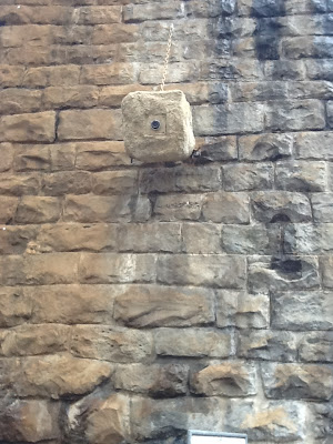
One of the exhibits at the Art and the City exhibtion running from June 7th until September 23rd in Zurich, Switzerland is from Swiss artist duo and Taiyo Onorato and Nico Krebs and is called Camera.
"The distinguishing features of film lie not only in the way man presents himself to the camera but in how, using the camera, he presents his surroundings to himself." Walter Benjamin, The Work of Art in the Age of Mechanical Reproduction. (1936)
 |
| Camera by Taiyo Onotaro and Nico Krebs |
Friday, July 20, 2012
Art and the City: Franziska Furter - Mojo
One of the exhibits at the Art and the City exhibtion running from June 7th until September 23rd in Zurich, Switzerland is from Swiss artist Franziska Furter and is called Mojo.
"As individual instances of artistic production become emancipated from the context of religious ritual, opportunities for displaying the product increase." Walter Benjamin, The Work of Art in the Age of Mechanical Reproduction.(1936)
 |
| Mojo by Franziska Furter |
Thursday, July 19, 2012
Art and the City: Charlotte Posenenske - Vierkantrohre Serie D
One of the exhibits at the Art and the City exhibtion running from June 7th until September 23rd in Zurich, Switzerland is from the late German artist Charlotte Posenenske and is called Vierkantrohre Serie D.
" being reproducible by technological means frees the work of art, for the first time in history, from its existence as a parasite upon ritual." Walter Benjamin, The Work of Art in the Age of Mechanical Reproduction. (1936)
 |
| Vierkantrohre by Charlotte Posenenske |
Wednesday, July 18, 2012
Art and the City: Alex Haniman - Vanessa
One of the exhibits at the Art and the
City exhibtion running from June 7th until September 23rd in Zurich,
Switzerland is from Swiss artist Alex Haniman and is called "Vanessa".
"The kind of reception in a state of distraction that to an increasing extent is becoming apparent in all fields of art is symptomatic of profound changes in apperception (...) The audience is an examiner, but a distracted one." Walter Benjamin, The Work of Art in the Age of Mechanical Reproduction (1936)
 |
| Vanessa by Alex Haniman |
"The kind of reception in a state of distraction that to an increasing extent is becoming apparent in all fields of art is symptomatic of profound changes in apperception (...) The audience is an examiner, but a distracted one." Walter Benjamin, The Work of Art in the Age of Mechanical Reproduction (1936)
Art and the City: Betinna Pousttchi - Ahead Only
One of the exhibits at the Art and the City exhibtion running from June 7th until September 23rd in Zurich, Switzerland is from Iranian/German artist Bettina Pousttchi and is entitled Ahead Only.
" [The work of art] had above all to meet one requirement: it must provoke irritation." Walter Benjamin, The Work of Art in the Age of Mechanical Reproduction (1936)
 |
| Ahead Only by Betinna Pousttchi |
 |
| Ahead Only by Betinna Pousttchi |
" [The work of art] had above all to meet one requirement: it must provoke irritation." Walter Benjamin, The Work of Art in the Age of Mechanical Reproduction (1936)
Saturday, July 14, 2012
Los Carpinteros: Catedrales
One of the exhibits at the Art and the City exhibtion running from June 7th until September 23rd in Zurich, Switzerland is from the Cuban artist duo, Los Carpinteros and is entitled Catedrales.
"Distraction and immersion constitute opposites (...) The person who stands in contemplation before a work of art immerses himself in it (...) The distracted mass, on the other hand, absorbs the work of art into itself." Walter Benjamin, The Work of Art in the Age of Mechanical Reproduction (1936)
 |
| Catedrales by Los Carpinteros |
"Distraction and immersion constitute opposites (...) The person who stands in contemplation before a work of art immerses himself in it (...) The distracted mass, on the other hand, absorbs the work of art into itself." Walter Benjamin, The Work of Art in the Age of Mechanical Reproduction (1936)
Wednesday, July 11, 2012
Art and the City: Richard Tuttle - The Pump
One of the exhibits at the Art and the City exhibtion running from June 7th until September 23rd in Zurich, Switzerland is from American artist Richard Tuttle and is entitled The Pump.
"The conventional is enjoyed without criticism, the truly new is criticized with aversion." Walter Benjamin, The Work of Art in the Age of Mechanical Reproduction (1936)
 |
| The Pump by Richard Tuttle |
 |
| The Pump by Richard Tuttle |
"The conventional is enjoyed without criticism, the truly new is criticized with aversion." Walter Benjamin, The Work of Art in the Age of Mechanical Reproduction (1936)
Subscribe to:
Posts (Atom)