Tuesday, August 13, 2024

Authenticity and Absurdity

Movie director Ridley Scott is known for creating an authentic cinematic world within each of his films. The battle scenes in his newest blockbuster, Napoleon, have been compared to the opening sequence of Stephan Spielberg’s Saving Private Ryan, for their sense of feeling real (though obviously neither is real). In his House of Gucci (2021), Lady Gaga (playing Patrizia Reggiani) and Adam Driver (as Maurizo Gucci, heir to the Gucci fortune), talk to each other in English, with what are meant to be Italian accents. Gaga spent months speaking English with her ‘Italian’ accent before film shooting began, just to get it authentic. There’s only one catch. Patrizia Reggiani and Maurizo Gucci, being Italians, didn’t speak to each other in English with fake Italian accents. They spoke Italian, with authentic Italian accents.

I found House of Gucci to be an almost unbearably funny film. Hearing a gaggle of British and American actors babble in English with hilarious Italian accents created an unintended comical performance. Had they spoken in their own accents, it would have seemed less absurd. Which goes to show, what may seem authentic from one point of view, can seem absurd when looked at from another.

Claims to authenticity pop up in the most unlikely places. In his piece ‘Thirst for Authenticity’, philosopher Dale Jacquette went as far as to claim that the popularity of craft beers “can be understood as a metaphor for a deeper thirst for authenticity” (Beer and Philosophy, ed. Steven D. Hales, 2007). But we don’t want to simply consume authentic foods in authentic restaurants washed down with authentic beers. We want to live authentic lives and, ultimately, become authentic selves.

You can read the rest of this article of mine in Philosophy Now magazine.


Sunday, April 14, 2024

 This is an outtake from the award winning documentary "Selling a Colonial War", directed by In-Soo Radstake and featuring me as an "international expert."


Thursday, August 11, 2022

How Dutch Historians Unremembered Decolonization

Irish historian Paul Doolan claims that for many decades, Dutch historians have inadequately investigated the decolonization of Indonesia (1945-1949). In Collective Memory and the Dutch East Indies, the result of over ten years of work, he states that historians were not innocent bystanders. “They played a significant role in silencing and unremembering the experience of decolonization in Dutch collective memory.”

Click here to read this article of mine in the journal The Low Countries, 1st March, 2022.

A Fictional War: Dutch propaganda and the Indonesian War of Independence (1945-1949)

 In December 1949, the Netherlands was forced to hand over sovereignty of its colony, the Dutch East Indies, to the Republic of Indonesia. Their long domination of the Indonesian archipelago had come to a brutal end with the Indonesian War of Independence (1945-1949). Hundreds of thousands of Dutch who had called the former colony home repatriated to the metropole and 150,000 soldiers returned from a war that had proven futile. Their memories were not forgotten, though their compatriots did not care to hear their stories. During the decades that followed, the war faded from Dutch collective memory. Today it frequently makes the news.

Click here to read my full article published at University of Exeter's Imperial and Global Forum, September 29, 2021.

Reservoirs of violence: Beb Vuyk's postcolonial stories

 The year 1945 marked the end of two occupations in the Kingdom of the Netherlands. The first occurred with the German surrender in May. The second came about with the sudden surrender of Japan in August. The ending of World War Two in Asia left the Dutch East Indies in a volatile and complex situation. The “liberated” Dutch found themselves surrounded by hostile nationalist forces loyal to the newly founded Republic of Indonesia. Years of violence and a full-scale war ensued, with the Dutch reluctantly ceding sovereignty to the new republic in 1949. This study briefly looks at the situation that unfolded in late 1945 Indonesia and attempts to explain why the Dutch found the new situation hard to comprehend and to accept. I suggest that the short stories of Beb Vuyk offer unique insights into the reservoir of violence that had been expanding prior to 1945, the shift in violence between 1945 and 1949 and the violence as it was experienced by Asians and Europeans alike. Accepting that Vuyk's position within the colonial complex was that of a colonial before the war, I maintain that Vuyk challenges colonial narratives by drawing out some of the pathologies engendered by colonial intimacies. By reclaiming local, native and particular histories, her stories written between the late 1940s and late 1960s reflect a variety of experiences and do not privilege the experiences of European victims over Indonesians. 

Click here in order read this article of mine, published in the Canadian Journal of Netherlandic Studies, Volume 40, Issue 2, 2020

Sunday, September 5, 2021


Here is the cover of my book, due to be published on September 27th, the result of over ten years of work.

Tuesday, December 8, 2020

To Forget or to Remember

 The final work of the French philosopher Paul Ricoeur, History, Memory, Forgetting (2008), provides a densely argued defence of the concept of collective memory. In one chapter he considers the short work on historiography by Friedrich Nietzsche, On the Advantage and Disadvantage of History for Life (1874). Ironically, what earned Nietzsche this special attention was Ricoeur’s need to ‘set apart’ Nietzsche’s work because it “contributes nothing to the critical examination of the historical operation.” Ricoeur saw Nietzsche as assaulting remembrance. By contrast, David Rieff, who attacked the concept of collective memory in his 2016 book, In Praise of Forgetting, applauds Nietzsche, and encourages the reader to take up Nietzsche’s moral imperative of ‘active forgetting’. Ricoeur and Rieff are on two different sides when it comes to social memory, but both authors share the view that Nietzsche prioritised forgetting over remembering history. As it turns out, both are wrong. 

More on this in my article in Philosophy Now magazine.

Beyond Profit

 The Dutch contribution to the transatlantic slave trade has long been thought to have marginal significance. But this depends on how one characterizes significance. I suggest that the Dutch slave trade was not just significant, but crucial in shaping the transatlantic slave trade. More on this in my article in History Today magazine.

Thursday, November 7, 2019

Audrey Amiss - Creating Outside of the Canon

As the popularity of ‘outsider art’ has risen, the art world has made significant strides in considering the voices of marginalised or disenfranchised artists. Audrey Amiss is a striking example of an unknown artist whose immense oeuvre, which was only discovered after her death, is marked by issues of mental health. Amiss’ art allows a bewildering glimpse into the life of a woman wholly preoccupied with artmaking, collecting, and recording. 

Read the rest of this article, written by my daughter Eilís Doolan

Thursday, May 16, 2019

Pride, Shame, and White Fragility in Dutch Colonial History

The 17th-century Dutch Republic made significant contributions to our understanding of world geography, the biological and physical sciences, mathematics, economics, international law, and the visual arts. Yet this Golden Age had a dark underbelly – the Dutch participation in colonialism and the transatlantic slave trade. In the estimate of the Trans-Atlantic Slave Trade Database, of the 12,521,337 Africans transported, 554,336 were brought to the Americas on Dutch ships.
Activist historians, many working from outside academia, persist in pushing the hidden history of Dutch slavery to the fore. Read more...

Saturday, September 3, 2016

Christo: The Floating Piers

Christo: The Floating Piers

This summer Europeans by the hundreds of thousands headed over the Alps (or should I say "under the Alps", creeping through the continent's longest traffic jam, the Gotthard Tunnel) and down to Italy. Well, nothing strange about that - pale but affluent North Europeans have been doing that on a regular basis since British aristocrats invented tourism in the 18th century by embarking on The Grand Tour. But this year was different. Many were heading to a smallish lake in the north of Italy to experience a temporary work of art. Yes, they weren't going to Italy simply to lie on the beach, or go shopping, or immerse themselves in the Renaissance. They were going in order to walk on water.


Christo's last work of art was The Gates, in Central Park, New York in 2005. Considering that he isn't getting any younger, (well, none of us are really) and he is now 81 years old, any new installation of Christo's might be his last, making it all the more imperative that if you want to see a work of this iconic artist of the globalized art world, then you had better get down to northern Italy this summer. And I must say, I didn't think twice.

Lining up for an hour in the heat in order to set foot on the Floating Piers
 Most artists work on paper or canvas or delve their hands in clay or apply their chisel to stone. For Christo, however, the sub-Alpine landscape of the north Italian lakes, specifically lake Iseo, was his canvas, so to speak. Imagine having a map of Lake Iseo and then, with a strong yellow pencil you draw a firm line across the map, back and forth. That's what Christo did. Except it wasn't a map of the Lake but Lake Iseo itself upon which he inscribed his shimmering yellow line; a line that stretched for four and a half kilometers across the lake to a mountainous island, that skirted the island and then darted across the lake again, to completely encircle a smaller island and then, via another route, return to the mountain and finally back to the mainland. His line consisted of 220, 000 plastic cubes lashed together, secured to the lake floor, and then covered with 100,000 square meters of dahlia-yellow nylon polymide fabric. The costs, 15 million dollars, were, as always, entirely paid for by the artist himself, without any subsidies. In late June The Floating Piers was unveiled and as with all of his works, the public were invited to experience it free of charge. Local authorities were expecting 600,000 extra visitors. Instead, 1.2 million came over a period of 16 days.

They came by the thousands


Unlike a drawing of a yellow penciled line across a landscape, in this work the viewer becomes a participant, a performer. You step onto and into the work and by walking across the piers, by sitting and sunbathing (swimming was forbidden), by picnicking or by collapsing from dehydration and being whisked away by the medical emergency service (something we witnessed three times on the scorching hot day that we visited), you become a performer in a massive, communal artistic event. Yet, despite the thousands of people who are involved in the construction of such an installation - the divers, the seamstresses, the lawyers, the cartographers, truck drivers, boat drivers, helicopter drivers, photographers, construction workers, engineers, local politicians, notaries, computer scientists, police authorities, volunteers, medical personnel, plastic factory workers, to name just a few - despite all of them, this is the work of one man. And, although all those who weren't collapsing from heat exhaustion or dehydration were having the time of their lives, as far as I could see, he didn't do it for us. No, this was the work of one selfish man who had a vision and whose motivation was, he wanted to see what it looks like. The work was totally useless, with no reason whatsoever to exist, except that Christo was curious to see what the colour yellow would look like, at dawn, at sunset, under the blazing sun, drenched by torrential cloud bursts, empty of all life, supporting tens of thousands of joyful people engaged in the utterly useless activity of going for a stroll across the water. Somehow, I suspect that hidden in here is a lesson for us all on how to live our lives.

Christo viewing his work and receiving the applause of the crowd

Thursday, July 14, 2016

Courbet's The Stone Breakers - Alive and Well in Winterthur

The Advanced Placement course in Art History is unique in that it is based on an in-depth knowledge of 250 pieces of art from all around the world. Teachers of this course know that two of the 250 works no longer exist. The Bamiyan Buddhas in Afghanistan were infamously destroyed by the Taliban. But the art history textbooks tell us that Gustave Courbet's oil painting The Stone Breakers from 1849, (number 113 in the list of 250) was destroyed and is, consequently, only known from photographs. Fred Kleiner's, Gardner's Art through the Ages, one of the most popular art history textbooks in the world, provides a picture of the work and, in the caption, writes: "Formerly Gemaldegalerie, Dresden (destroyed in 1945)." Alas, the work was a victim of the British incendiary bombing of Dresden on the night of February 13th 1945, a bombing raid immortalized in literature in Kurt Vonnegut Jr.'s Slaughter House Five. It is thus very sad that we can only ever know this work second-hand, so to speak, from photographs like this one:

Gustave Courbet, The Stone Breakers, Oil on canvas, 1849


But hang on a second. Imagine the surprise of an AP Art History teacher or student who visits the marvelous Oscar Reinhart collection, housed in the small museum 'Am Romerholz' in Winterthur, Switzerland, and encounters the following painting:

Gustave Courbet, The Stone Breakers, Oil on canvas, c. 1849


More than likely, they won't believe their eyes. Especially when they read the identifying label, which states: "Gustave Courbet, The Stone Breakers. Oil on canvas, c. 1849.". What's going on? Has the work risen from the grave or, phoenix-like, from the ashes? Or have the wily Swiss secreted the work away all along, (like they have done with great deal of the world's stolen art!). Of course if the surprised connoisseur of 19th century French Realism happens to have a photographic memory, or happens to have a photograph of number 113 in her pocket, or (more likely) has an iPhone and does an internet search and locates an image of the destroyed work, she will see that the two images are not identical.

Firstly, the painting in Winterthur is darker in colour and the jacket of the old man kneeling down is not red and there is no flash of sky blue in the upper right corner. The attentive viewer will notice that above the men's heads in the work in Winterthur, is a lot of negative space. In the destroyed version, the men are more monumental, the standing youth's head reaches almost to the top of the canvas. The basket to the left of the young man has disappeared in the Swiss version. The wall that the men seem to breaking down is lower in the Winterthur painting than in the Dresden painting and the men's feet are closer to each other. Another difference, but impossible to see, is that the destroyed version was bigger by far, but we don't notice this because we only know it from small photographs.

But, of course there is one other, very obvious difference - they are reversed images of each other. Could it be that every text book has gotten it wrong and the photographs in books reversed the negative, providing us with a mirror image of the real work? It wouldn't be the first time this has happened? But no. If you look carefully you will see that Courbet signed the Dresden painting in the bottom left corner, and his signature reads the right way around. Most mysteriously, in the Winterthur painting he has signed it in the bottom right hand corner.

So why two versions of this painting, with the exception of some minor details, almost identical except for size and reversal? It is that latter contrast that is the real mystery. The fact is, no one knows. Perhaps the smaller painting was a sketch - but why the reversal? In the annotated catalogue of the Oscar Reinhart Am Romerholz collection we find the following suggestion: "The smaller picture, less highly finished and showing the scene in reverse, is perhaps later in date and may have been painted as the basis of a print, which would explain why it reproduces the motif as a mirror-image". Perhaps. I suppose it is a good explanation. Only problem is, I don't know of any 19th century print of this work. Such a piece of material evidence would certainly be needed to satisfy that explanation.

So, it remains a bit of a mystery as to why Courbet painted this scene twice, one big version and one smaller. But for me personally, the bigger mystery is why does the art history world ignore the version in Winterthur? Could it be that the authors of the textbooks, like Fred Kleiner, are unaware of its existence? The Khan Academy has helpfully and generously produced a series of posts that provide background on every one of the 250 in the AP Art History course. But they seem to be unaware that a second version of this work is still in existence. Don't take my word for it, you can access their post here.

The oil painting The Stone Breakers in Dresden must have been an overwhelming, monumental work. Alas, it was destroyed. But it is not the case that we must make do with only small, paper reproductions in our textbooks. Teachers and students of art history should be aware that a very real oil painting of The Stone Breakers by Gustave Courbet is alive and well and living in the Oscar Reinhart Collection 'Am Romerholz' in Winterthur, Switzerland. I saw it there myself just yesterday.


Saturday, April 2, 2016

H. Craig Hanna at Luxembourg National Museum of History and Art

During a recent trip to Luxembourg City I stumbled across the work of Paris based American artist H. Craig Hanna. And what a happy day that was.

H. Craig Hanna, Mother and Child, 1913


The exhibition is Hanna's first ever museum show (let there be many more!) and the centerpiece, "Arrangement of Dancers", recently purchased by the museum, is his first work to be sold to a museum. I hope many others will add his work to their collections, though that might be demanding too much courage from contemporary museum directors.

H. Craig Hanna, Arrangement of Dancers

Although experimenting with new media, like painting  with ink on perspex, Hanna clearly stands in the European tradition of art. He has studied the greats, learned technique through imitation, before experimenting and creating his own style. Obviously Hanna has been inspired by the great works of the western history of art - works from people like Titian and Velazquez, but also more modern painters like Sargent and Whistler. His works reveal a meticulous attention to composition and colour. Subjects are overwhelmingly portraits, nudes and occasionally landscapes. What they all have in common is that they strive to achieve beauty.


All of which means that Hanna is certainly painting against the grain. Indeed he is way out of step with the times; he's even got talent. And talent, as a former pupil of mine, now a student in one of Europe's leading art schools, was told by her tutor, artistic talent is not only valueless, worse, it is a distinct disadvantage. Let's face it, the works of Ai Wei-Wei and Tracey Emin don't demand a lot of craft, but this is what museum directors want to see in their collections. At the big art fairs that control the supply and distribution of artworks, like Art Basel and Frieze, artistic skill counts for naught, less than naught. Needless to say, Hanna has never been allowed to exhibit his works at any of these mega-exhibitions.

My daughter went down to the Venice Biennale a few months ago, equipped with her sketchbook and journal. Together with her teacher and fellow pupils from her International Baccalaureate Higher Level Art class, they wanted to study, write about and perhaps sketch works from the world's leading artists today. She loved Venice of course, but came back with her sketchbook empty and a fairly depressing opinion regarding contemporary art. I'm not surprised. Luckily she also attended Hanna's exhibition. Though critical of some of his pieces ("a bit too like Japanese animation"), all in all, she was inspired.


It's not that I'm against any artist who exhibits at one of the globally marketed shows. I love the work of Berlinde de Bruyckere and the work of Anselm Kiefer, to name just two. But there is an awful lot of bullshit out there. And a lot of bullshitters too. And there is a lot that lies in-between. Artists who have some interesting things to say, but who receive an amount of attention that is exaggerated, especially when one considers figurative artists like H. Craig Hanna, who receive too little attention.

Take one of the stars of the Venice Biennale 2015 for instance, Samson Kambalu. His contribution to this prestigious exhibition was 400 footballs that are plastered with texts from the Bible. They look like this:

Now, obviously Mr. Kambalu didn't write the Bible, nor did he make the plastic balls. He may not have even gone to the trouble to print the texts or do the sticky work of gluing them to the balls. Maybe he has 'assistants' to do that. Hey, in fact you can make one yourself  - just watch his DIY video.

In other words, Samson Kambalu simply came up with an idea, (or maybe somebody else did). In fact he came up with the idea over 15 years ago, and he has been flogging it ever since at leading exhibitions all around the world, in between giving TED Talks and guest lectures at places like Oxford University's Ruskin School of Art (one wonders what Ruskin would think). 

The question is: is it a good idea that he had? Is it a shitty idea? Is it a good work of art or is it a piece of crap? Well, there isn't really any criteria to judge, is there? We can certainly agree that it involves no skill, no craft and nothing that looks like what used to be termed "artistic talent". All we can say is, it is the type of thing that lots of Kambalu's fellow graduates at Chelsea College of Design aspire to. And the artworld loves it. In the little promotional video clip of the Venice Biennale, Mr. Kumbalu mentions that he was inspired by Michelangelo's Last Judgement. I'm not making it up, he says it himself. On yeah, I'm sure he was inspired by Michelangelo, but I wonder for how long did Kambalu sit before Michelangelo's work, how long did he study it before it provided him with inspiration? Somehow, I suspect that Hanna and not Kumbalu has been more deeply inspired by Michelangelo.

So, I guess, in this centenary of the birth of Dadaism, what it boils down to is answering the question - What is art?  I favour the burning warehouse theory. Imagine a warehouse is burning down. You are ordered to run inside the burning warehouse and save the artwork or artworks inside. You have no idea what is inside, but you know you must run in as quick as possible and run out immediately with the art. You run in and you spot, in one corner, a work that you've never seen before, let's say Hanna's "Arrangement of Dancers". In the other corner you see a work that you've never seen before, let's say one of Kambalu's "Holy Balls". Now be quick, the fire is burning: with which one will you run out of the warehouse?

The exhibition "H. Craig Hanna: Paintings and Drawings" runs until late May.

H. Craig Hanna, Laurence with blue glove, 2012

Sunday, November 1, 2015

Roman Portraiture

Some, with slight exaggeration, claim that we live in the century of the selfie (though who can assume that the selfie will last the century?) This selfie, of three world leaders, made the news a short while ago (do you remember who the female is?) 


Maybe not such a polite thing for our trusted leaders to be doing, considering that they were attending a memorial service, but hey, if you had attended the Nelson Mandela memorial service, wouldn't you have taken a selfie too? (I seem to have gotten into a bad habit of ending each sentence with a question, so I'm going to stop that now.)

So, what is this obsession that we have with our own faces? (Oh, there I go again!) We can certainly trace it back to the Renaissance, with the birth of the modern portrait, when even the artists like Michelangelo and Botticelli start slipping their own faces into their paintings. By the time we reach Rembrandt the self-portrait has come well and truly into its own.


But the history of the selfie goes back much longer than this, to a tradition in the Roman Republic, when a citizen could celebrate their position in society by means of sculpted portraiture. The old patricians of Rome, when burying their dead, had the habit of organizing a funerary parade in which they would carry the wax busts of their ancestors. It was a way of proving and displaying their long, proud lineage. So the portrait was of great importance and every upper class Roman family would keep a collection of marble likenesses of their male ancestors in a cupboard at home, much like we keep family photo albums. (Sorry for another question, but do people still keep family albums or is that unspeakably previous century?)

The funny thing about portraits from the ancient Roman Republic, is that they didn't attempt to beautify their subjects. They didn't even try to hide their age, as we do in our culture that worships youth. On the contrary, Roman Republican portraiture magnified the aging process if anything. Images of the great and powerful would be displayed on pedestals in public places, examples for all to emulate. Take this Head of a Roman Patrician from around 75 BCE for instance.


The subject is certainly no spring chicken. So, would he have been pleased to see himself being depicted like this, wrinkles and all. The fact is, he would have been delighted. For the truth of the matter is, hyper-realistic portraits, like this one, embodied the ideal of the hard working, serious upper-class citizen. This man might have been privileged and well off, but, his portrait tells us, he has worked his socks off for the good of his family and, equally important, for the welfare of the state. No partying or super yacht cruises for him. Instead, he would have us believe, he has dedicated his life to the high-minded fulfilling of his civic duty. In other words, the portrait reflects two characteristics that were greatly valued by the Romans of this time - seriousness or gravitas and virtue. He wears his wrinkles proudly and each one bespeaks his gravitas and virtue. A bit like the serfs of the corporate world today who complain of how hard they work and who wear their stress as a banner of pride.

Inge Lyse Hanson of John Cabot University in Rome has argued (in a lecture that I attended in July 2015) that these Roman Republic portraits must be seen as being in opposition to the Greek values of the Hellenistic world where, for instance, Alexander the Great was portrayed as a youth. Greek sculpture depicted leaders as being young, smooth-skinned, turned to the side with their gaze to the distance; Roman patrician sculpture, on the other hand, showed their leaders to be old, wrinkled, looking straight ahead and staring at the viewer. Furthermore, she insists that these busts were earned, that each statue represents an award set up in a public space by the grateful citizenry.

Art historians refer to this style as Verism. Which might, verily, give you the impression that these portraits reflect reality. But that is not the case. This is art, after all, not reality. These are idealized images, representations of ideas Today we photoshop or airbrush out our blemishes and wrinkles, but in those days they added them in. The times have changed. But they already changed soon after the collapse of the Roman republic and the rise of the Roman Empire.

Take a look at this image, from the Vatican Museum, for instance, from the 1st century CE. The blemishes and wrinkles are gone.


Or even better, look at this portrait of Emperor Augustus, from Primaporta, now in the Vatican Museum. Every town in the empire had its official portraits of the emperor, but unlike the veristic portraits of the Republic, the image was one of idealized youth. Augustus would rule for decades to come, but in his portraits he never grew older. He had, literally, invented a new never changing time to go with his new office of Emperor, a time in which he never ages in any portraits, just like the queen of England never ages in any British postage stamps.


Instead, his carefully cultivated public image remained that of the Greek ideal, clearly based on the famous classical statue, Doryphoros by Polykeitos:


At Augustus' feet we find a small cupid, riding a dolphin. The presence of cupid indicates that Augustus is a God, hence his perfect looks and eternal youth.


One obvious difference between Augustus of Primaporta and Doryphoros is (you've probably noticed) Doryphoros is nude, while Augustus is wearing body armour. In fact there are portraits of Augustus that are semi-nude or entirely nude, after all, when you have the perfect, idealized, youthful body, why not show it off?  It is just that in this particular incarnation the Emperor is portrayed as the warrior who has defeated his enemies Mark Anthony and Cleopatra, thereby ensuring the safety and security of all the citizens. In fact his cuirlass or breastplate depict a diplomatic victory that he achieved over the Parthians.


 So, in short, portraits always project an image. Sometimes, as in these Roman portraits, the image that is being projected could be labeled as propaganda. What of our own leaders today? They certainly don't have themselves depicted in the nude, nor do they openly confess to being divine.But would they dare to partake in the sort of role play that the ancient Romans did, dressing up as warriors and so on? Surely we are far too sophisticated to be taken in by democratic leaders who don battle gear. Like this one for instance, who dresses as a warrior and, like Augustus, stretches his arm out towards his troops, a contemporary Primaporta image.


Or let us not forget the following warrior leader, who, though having never set foot on a battlefield, still sported a military codpiece. What are these guys trying to prove?


Saturday, September 12, 2015

Men Blessed by Daughters

American blues singer Greg Brown has a song that has the refrain "I'm a man that’s rich in daughters." A friend gave me a copy when my third daughter was born. I was reminded of this recently when I was in Berlin for the weekend.


Although I was at a conference all day long, it turned out that  the Saturday night was The Long Night of the Museums, so I headed down to Museum Island. The atmosphere was relaxed, with Berliners of all ages dancing on the banks of the Spree while hundreds sat in deckchairs drinking wine and beer as the Berlin Chamber Orchestra played a free concert outside the Museum of Ancient Art.  I enjoyed the ambiance, but I was on a quest, and so I joined the line for the Egyptian Collection in the Neues Museum.

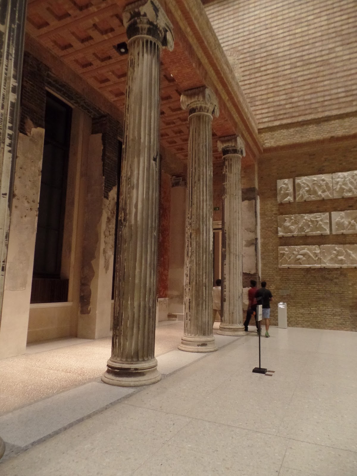
Having ascended the stairs to the second floor, I stopped to examine the old columns of the museum that still bear the scars of World War Two bombings. English architect DavidChipperfield recently renovated the building, (it had been so damaged by Allied bombing that it remained closed until 2009) but preserved the damaged old columns, now integrated into the new facility. It seemed somehow appropriate that these vestiges of the Nazi period are now embedded within a museum of ancient history

Classical columns still bear smoke damage.
Column damaged by Allied bombing


The collection from the Amarna period of Egyptian history includes a number of stunning masterpieces. Most people crowd into the dark room that hosts the famous bust of Nefertiti. She sits in a glass case alone in the centre of the room. People stand in a circle and gaze reverentially at her beauty.A hushed silence reigns, broken only by the harsh outbursts of a guard "No photos!". This is art that is put on a pedestal, metaphorically as well as literally. I have an uneasy feeling that I've joined with a number of strangers in some fetishistic activity, a confirmation that the museum has replaced the church in contemporary European life. The object of our adulation might be three and a half thousand years old, but she looks like she belongs in a fashion magazine, or at least could be strolling the streets of Berlin. Being a bust though, obviously that would be difficult. But dare I say it, and I don't mean this as an insult to anyone, living or dead, but it strikes me that Nefertiti might be the best looking person in Berlin.

However,  on this night I wasn't interested in Nefertiti alone. I was looking for her and her husband, a man like me, blessed with daughters. And there, in a little alcove, almost hidden away, I found what I was looking for, a relief depicting the Pharaoh Akhenaton and his wife Nefertiti with three of their five daughters. It is a scene of such unbelievable poignancy, that on this night, alone in Berlin, far from my three daughters and their mother, I feel a connection with this portrayal of simple domesticity.


Egyptian art has a certain timeless quality, not least because its stiff portraits followed a formula that remained the same for thousands of years. But this small stele, probably made as a household shrine, with is curvilineal forms, is anything but stiff and doesn't strike me as being formal at all. This is a glimpse of an intimate scene of familial love drenched in the rays of the sun god. 


The pharaoh, Akhenaton, sits on the left, raising his youngest daughter to his lips, as he gazes downward in an expression of fatherly love. See how his left hand protects her head while his right hand, with its long slender fingers, tenderly supports her thigh.


His wife, Nefertiti sits on the right, with a second daughter leaning against her shoulder. The child's right hand might be pointing at the sun, but I like to believe that it is brushing her mother's cheek, while her left arm drapes casually over her mother's shoulder.  The third, older, daughter sits on her mother's lap, pointing towards her dad with her right hand, while her left hand rests in her mother's hand and her face is turned upwards towards her mother. "Look mum", she might be saying, "daddy is kissing the baby". 

This might be one of the greatest works of art ever made, but is a scene that, on this beautiful late summer evening, I find it easy to relate to. I think it speaks to all men blessed with daughters. 

Monday, August 24, 2015

Caravaggio in Dublin, Triumph of the Soulless


Having once been in Malta and failing to see that island's sole Caravaggio painting, I was determined not to make the same mistake when recently visiting the island of Ireland. The Taking of Christ can be found in Dublin's delightful National Gallery of Ireland - delightful because of  the courtesy of the museum staff, the fine collection of art, the lack of crowds and the fact that it is free of charge. So, perfectly reasonable to drop in, in pursuit of a glimpse of a single work.


The Taking of Christ is the latest Caravaggio to be discovered. Half the art history world (admittedly, a small, select world) had been wondering for years where could Caravaggio's The Taking of Christ be? For a half-dozen or so passionate academics (not an oxymoron by the way)) the hunt for the missing Caravaggio was the equivalent of the hunt for Osama bin Laden. And it was eventually found in, of all places, Dirty Old Dublin Town. It had been hanging for years in the dining hall of the Jesuit order in Dublin without the Men in Black quite knowing that they had a treasure from the master himself. They believed that the painting that greeted them every morning while they eat their simple porridge was a copy of Caravaggio's missing masterpiece. In the early 1990s it was discovered that what they had thought was a copy, was actually the real thing!  Now it hangs proudly, all cleaned up, spic and span, in the National Gallery.


Let's skip the fact that Caravaggio, between wild nights of debauchery, regular fighting and murder was an incomparable master of his craft, possessing a knowledge of light and shadow that puts him almost on a par with Rembrandt. All that is a given. But there are a couple of quirky things about this work that I must say I love. Firstly, there is the centre of the piece. It is the chap's armed shoulder. In a painting that depicts the arrest of Jesus Christ, Caravaggio dares to make the exact centre of the picture the luminous orb that is the soldier's metal shoulder. He has literally given us the cold shoulder. What a dare-devil. And incredible that it works. We are drawn towards the reflective surface, half expecting to see our own image staring back at us.And where does the mysterious light that illuminates the long metal arm come from? Certainly not from the rain-swollen Dublin sky.

Then there is the face of the guards. We only catch a glimpse of of the first one. But it could be your Dad. For some strange reason his nose is eerily 21st century.  And the chap to his right looks like he could be standing on the terraces cheering for St. Patrick's Athletic. His beard is red-tinged, making him very at home in Dublin. He is just a bearded, working-class lad, doing his job. 

I also love how Caravaggio has inserted himself into the painting. He is in the top right, holding the lantern. Yes, holding the lantern that throws a bit more light upon the scene, but not to help out the soldiers in their filthy work, those obedient, brutal footmen of the establishment. No, he is holding up the lantern in order to lighten up the scene, so we can enjoy it. That's right. The artist is someone who holds up the light so that we can see. As Matisse wrote, happiness comes from "illuminating the fog that surrounds us." Look at his eager face;  he doesn't want to miss a second of the scene that he is illuminating, the scene that he is painting.


One more thing that I love about this picture, and maybe it is purely personal, but it so very obviously reminds me of Star Wars, or any mythic-science-fiction-fantasy in which freedom is threatened by the mindless robots that serve the conformity of the machine. For that is what the armor does to the guards arresting Jesus. There is a third guard hidden behind Caravaggio; we can only see his helmet and one staring eye. The faceless eye of surveillance. That's what armor does to all us, doesn't it? Maybe in the weekend we cheer our children's football team, or sink a few pints with the lads. Maybe we're good fathers, loving husbands. But let us clamber into our shiny, squeaky uniforms and we become exactly what is needed in order for the soulless to triumph. Such are the ideas that seeing this Caravaggio puts into my head. I dare you: see Caravaggio and tremble.

Sunday, August 23, 2015

Zurich's Kunsthaus Could be the Receiver of Stolen Jewish Art.

Manet, La Sultana (Photo: Wikimedia Commons)
Sometime ago I wrote about the new extension planned for Zurich's Kunsthaus, designed by the British architect David Chipperfield. The extension will house the impressive Bürhle collection, part of which was last exhibited a few years ago at the Kunsthaus. The collection will, when opened to the public in 2020, torpedo Zurich's Kunsthaus into the top tier for public collections of French Impressionism. In fact, Zurich will be second only to Paris.  But tomorrow a book will be published from which the fallout is sure to complicate matters.


During the past few decades most major art museums have been forced to audit their collections, or at least give an impression they are doing so, in order to ascertain whether they hold any art that was wrongfully taken from Jewish owners during the era of Nazi rule in Europe. This can be in the form of art that was simply robbed by the Nazis, or art that was bought by an innovative collector at knock-down prices because the unfortunate Jewish owners, fleeing from the Nazis, were being forced to sell.

A couple of years ago the world was intrigued by the Cornelius Gurlitt story, when over 1,000 formerly Jewish owned works of art were discovered in an apartment in Munich. Gurlitt has since died and, for some strange reason, he bequeathed his collection to an art museum in Bern. This was a nice windfall for the museum, but brought rather a lot of unwanted attention - was Switzerland simply going to accept a gift, even when the gift is stained with Jewish blood?

Cezanne, Paysage (Photo: Wikimedia Commons)
The new book that will appear in bookstores tomorrow, Schwarzbuch Bührle [Blackbook Bührle] makes the argument that the Kunsthaus might be the receiver of stolen goods via the controversial Bürhle collection. The fact that the industrialist Bürhle supplied Nazi Germany with weapons is already somewhat embarrassing, but now the Kunsthaus will have to deal with this added complication. The grave accusations will certainly lead to further public discussion as co-editor and one of the authors of the book is Guido Magnaguagno, who happens to have once been Vice-Director of the Kunsthaus. The opinions of this esteemed art historian and museum leader will be taken seriously. Indeed the pending appearance of his book has already made front page news in Switzerland this weekend.


In the new book Magnaguagno lists 12 works that are particularly suspicious because of the so called gaps in provenance, works from Cezanne, Courbet, Manet, Utrillo, Monet, Van Gogh, Modigliani, Kalf, Braque and Corot. No doubt we will hear a lot more about this before the new extension opens in 2020.
Monet, Poppy-fields at Vetheuil (Photo: Wikimedia Commons)

Sunday, August 9, 2015

On Late Rembrandt at the National Gallery and the Rijksmuseum


In the spring I spent a few days in Amsterdam and happily went along to the newly renovated Rijksmuseum. This was my first visit to the museum in many years. Although it had been closed for a few years for renovation, a part of its collection had still been available to the public at Schipol International Airport. This was an excellent example of Dutch innovative thinking - what other international airport offered for contemplation the works of masters like Vermeer and Hals to passengers in transit?

I was impressed by the renovation, especially the new entrance hall, which reminded me of a scaled down version of the entrance to the Louvre in Paris and even the British Museum in London.  But the main point of my visit was the exhibition "Late Rembrandt", which had already been shown in London's National Gallery in 2014-1015. Now, however, the artist's late works were all coming home. to the city in which he had lived and worked.

The Jewish Bride
Surprisingly, this was the first exhibition ever dedicated exclusively to Rembrandt's late works. I particularly enjoyed seeing two of my favourite paintings. "The Jewish Bride" and Bathsheba with King David's Letter.

The so called The Jewish Bride is properly known as Portrait of a Couple as Isaac and Rebecca.  Vincent van Gogh told a friend that he would gladly give ten years of his life just to be able to sit in front of this painting for two weeks. Let's be grateful that he didn't, for a van Gogh dead ten years younger would have cheated the world out of a great number of  his masterpieces.  But we can all understand his sentiment. The moving embrace and the loving yet sad expressions on the faces make this one of the world's most intimate paintings.

The tender embrace

But seeing it in the flesh, so to speak, what struck me most was the complexity of the texture of the painter. It is no wonder that Rembrandt was considered a revolutionary.  The jewelry sparkles and seems to reflect the light on the room. The paint is caked onto the canvas. And I use the term caked deliberately -  I was tempted to lick it! Rembrandt layered the paint on thickly using his palette knife, or probably multiple knives.  Look at this sleeve for instance. You can almost reach out and tug it.

A close up of his sleeve - you feel like you could tug it
Close up of her dress, layered on with a knife
The other painting of Rembrandt that I love is Bathsheba with King David's Letter. It rivals The Jewish Bride for its tenderness. The force of this painting is extraordinary in the way that it makes the invisible visible.

It is the inner emotional turmoil of the mind that is the subject of the work - should Bathsheba agree to the king's demands outlined in his letter that she holds in her hand, or should she remain faithful to her husband. Recently X-radiography has revealed that originally Rembrandt had painted her with a shocked expression on her uplifted head. But in a stroke of genius he changed this. Instead, the picture is almost entirely motionless, she is profiled against a dark background, her white body illuminated by light. Our eyes travel upward, from the servant at her feet, to the letter in her hand, along her nude body and arrive at her face, exquisitely rendered, lost in contemplation. It is, I would venture, one of the most beautiful faces in western art.

One of the most beautiful faces in western art

Late Rembrandt brought together many exceptional works by one of the most exceptional artists. That said, not everyone was impressed. This young lady for instance. While she might share the beauty of Bathsheba's face, her expression does not reflect an inner moral dilemma, just plain irritation. She is clearly thinking, when is my dad going to be done and we can get out of here.


Friday, June 26, 2015

One Hundred Days by Lukas Barfuss

Lukas Barfüss, One Hundred Days (Granta Books, 2013)

I’m sure you’ll agree, translators are the nicest people in the world, (teachers excepted of course). Just think about it, some poor, asocial sucker, with the loneliest job in the world, has spent the past year or so locked up in a room writing a book.  Along comes the translator and, in return for a pittance, sits for the best part of half a year or so locked up in a room and miraculously turns the foreign words into something you can understand, thereby allowing you to break out of the narrow-minded parochialism that comes with being an English speaker and actually hear what other people (the majority) are saying in other languages. So three cheers for Tess Lewis (whoever she is), for translating the novel One Hundred Days by the young Swiss author Lukas Barfüss.

In this contemporary version of Conrad’s Heart of Darkness, steamy sex and genocidal murder make for a potent mix, told in deceptively simple, taut prose. The protagonist is a naïve chap by the name of David Hohl. He has always been moved to fight against injustice. Had he gone to Zurich International School he would have won the ZIS Cares Award. So he gets a job in economic development and his first post is in the sleepy African backwater of Rwanda. But, the surface is deceptive and Rwanda is about to explode into the 1994 well planned genocide of Tutsis. In the one hundred days of the title the Hutus slaughter nearly 800,000 people. Because he is obsessed with a beautiful, but racist Hutu woman, David Hohl refuses to be evacuated, and instead stays and witnesses the slaughter. No wonder his name is Hohl (which means hollow).

Barfüss reveals the hypocrisy that lies at the root of Swiss development work. His book is a meditation on how a strong sense of virtue can gently lead to passive participation in the most horrifying cruelty. Most of all, his book works as a metaphoric warning against being sucked into any organisation that comes to see efficiency as an end in itself - surely a lesson for us all. Peaceful, well organised Rwanda was sometimes called the Switzerland of Africa. Barfüss sees that you can reverse this, seeing Switzerland as the Rwanda of Europe. He reminds us that Switzerland is a well-oiled machine that runs smoothly, where order, routine, discipline and respect for institutions holds sway, but adds: “These characteristics are not impediments to mass murder, but necessary conditions. Evil loves nothing more than the proper implementation of a plan, and in that domain, you have to admit, we are world champions.”


This book has garnered Barfüss a number of literary prizes, as well as nominations for the biggest book prizes in Germany and Switzerland. He is, of course, almost unheard of in the insular, provincial English speaking world.